Why you should be prototyping
The following is adapted from a talk I was asked to give at Netflix, to promote the idea of prototyping in engineering teams. I figured it also gave me the opportunity to post an update on what I’m working on these days!

Hi everyone! My name’s Rachel Binx, and I work as a Design Technologist on the Content Science & Algorithms team at Netflix. Our team is using data science to help the company make more informed decisions about content — choosing what licensed content we should add to the catalogue, and what original content we should produce.
Our team consists of 10 data scientists and myself. Before I joined, these data scientists would do the majority of their work in R or Python, and built their own interfaces on top of the models using Shiny, or basic HTML. There were several partner engineering teams who were tasked at turning these proof-of-concept models into a real application. The problem was, these other orgs didn’t always have free time to tackle new projects. More importantly, the data scientists wanted to prove that their work was actually useful before the company devoted engineering resources.
So that’s where I come in: my role is to prototype frontends to these models, test them with users, and iterate on the UX until we have something that is rock-solid. Then our engineering partners don’t waste their time on experiments that won’t work out, our users get a better product, and everyone’s happy.
There is a clear organizational need for prototyping on my team, but I would argue that all engineering teams should prototype. Why’s that?

Ok so this is meant to be a tad inflammatory. My point is that when you talk to someone about their process and their frustrations, all of those issues are very real, and you should take note. However, they probably also have ideas about how the workflow/interface/etc should be built differently, but they are probably wrong about that being the best solution. That’s ok, though, because your first attempt at solving it will also be wrong.
To put it another way:

To be clear: I don’t mean catastrophically wrong, I mean wrong as in “not perfect.” I’ve never seen any designer, or anyone, get 100% UI and UX on the first attempt. That’s ok! That’s why we prototype.
(Also: how freeing it is to know that you won’t get it right on the first try!)
I think all product people have had the experience of building a tool exactly to spec, and then finding the customer unsatisfied with the end result. How frustrating! We can solve this problem by moving away from letting requirements define a project, and instead turning to user research.
To be clear: user research is not about asking people what they think you should build, or collecting a laundry list of feature requests. User research is observing the existing processes that people use to complete their task, identifying frustrations (pain points) and hypothesizing how to make the tool better.

Once you’ve collected your research, that’s when the fun starts. It’s important to remember, though, that prototyping is just one of a suite of approaches in designing the ideal product:
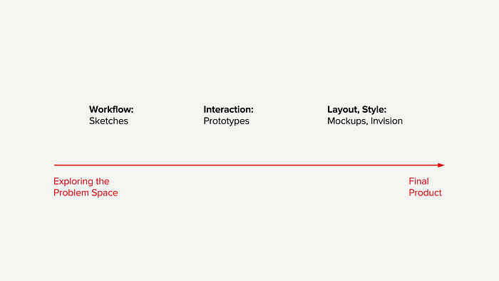
These three techniques are ordered in increasing fidelity, and roughly temporally, according to the phase of the project in which they are most often used. The linear order imposes a bit of a value judgement, though, and I prefer to think of them as 3 valuable techniques to complement one another.
To borrow from one of my favorite diagrams:

The above image was titled “why I don’t wireframe much,” but I like how it lays out the relative strengths of each.
Paper Prototypes
Alright designers, so feel free to skip over this part and roll your eyes at us ignorant developers. Developers, let me tell you about paper prototypes.

So the idea of paper prototypes is literally the above image, where you draw out a UI and ask people to “navigate” through it by tapping their fingers on boxes. Then you, the prototyper, lays down another piece of paper on top to simulate the UI update.
I had not encountered paper prototypes, or at least this level of formality with sketches, until I was at JPL. I will be frank with you. I was horrified that we were planning to show spacecraft engineers drawings of UI and ask them to “click” by poking a drawing. I expected to be laughed out of the room.
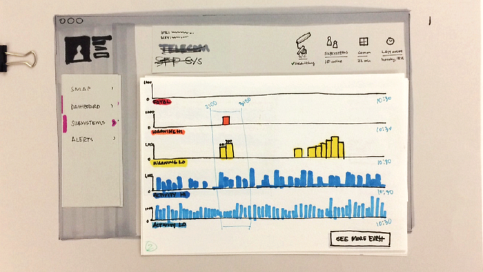
However, the system work, hallelujah. I had the privilege of working with a very talented designer named Erin Murphy on this project, and below are her paper prototypes. Once the spacecraft engineers got over rolling their eyes at us and actually started playing along, we got results. And fast!
Some context: we were working on a better design to display spacecraft Event Records, or EVRs. Think of it like a bunch of console logs for spacecraft activity. They’re used for monitoring health and investigating anomalies, and currently they had been displayed as a giant endless scrolling list of text. The list was important, yes, but we wanted to see if we could come up with a better way to provide information about the set of EVRs. We had a hypothesis that a histogram of EVRs, sorted by type (diagnostic, command, warning) would be helpful for the operators.
Erin drew the below histogram, and we were off to the races with testing.
My favorite part of that design is the “See More EVRs,” which is laughably simplistic. We had no idea how people would react to seeing the data in this format, or what they would want to do next. I love this button because it forces the user to respond to it and talk through what they wish it would do instead.

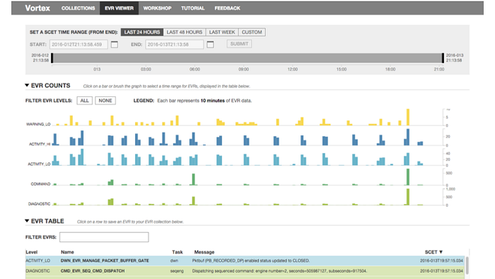
As you can see, the next iteration of this paper prototype had much more UI on it. We had time selectors, filter options, a legend, it was perfect! This sketch was pretty close to what we built in the final product:
Interactive Prototypes
Unfortunately, this is the part of the talk where I went through a number of case studies of interactive prototypes of my work at Netflix, none of which can be shared publicly. So… use your imagination ;)

The point of a prototype is to simulate how users will be interacting with the final version, and to find out if your sketches were a good idea! I try to get to this phase as quickly as possible, because I think that seeing real data in the interface will make it drastically easier to know which features to build. It also builds trust with your users — if you can show them the data that they are used to working with in your new tool, they will be much more engaged in providing feedback.


One more note on the importance of real data: It’s human nature to have an idealized idea of the data when one starts the design process. The real dataset will almost always have some idiosyncratic patterns that don’t work with your design process, which is why it’s important to bring in real data as soon as possible. The two images above area meant to illustrate this with graph data — when designers draw a graph, it’s almost always a curve like the one on the left: continuous and smooth. Tools for exploring and analyzing the yellow curve might not work for the three graphs on the right. (For the curious, those three graphs are cartoon versions of real NASA data: instruments on Cassini, SMAP, and MSL respectively.)

A common pitfall that I’ve seen in prototyping is the prototype creator spending too much time building out the prototype before showing it to anyone, worried that what they’ve built isn’t substantial enough. My personal philosophy is that no prototype is too small, and even a tiny part of the UI can benefit from its own prototype and testing, before being absorbed into the larger prototype.
One last word about design — it takes a very small amount of visual styling to effectively test the interaction experience of a prototype. In fact, I would argue that an unstyled prototype is more effective than a styled one, because users intuitively think of the design as more malleable. I know some people who go so far as to use the default CSS styles on their prototypes! (I love me some bold Times New Roman) Visual polish suggests that the creator is emotionally invested in the UI — use at your peril!
Mockups/Invision

Mockups are probably the most familiar part of this workflow in engineering teams, so I won’t spend much time on them. I do want to give a quick shout out to Invision, which is a tool for generating click-prototypes with mockup states.
With the help of a talented visual designer, these mockups will look gorgeous. However, I would personally avoid them until you have your UX rock-solid. Too much design polish causes people to think that the designs are set in stone. They are great, however, for confirming how the final product should work with an engineering team!
At Last, User Testing

User tests are always nerve-wracking for me — it’s hard to put your work out in the open and discover its flaws!
The most important part of a user test is to not start the meeting by explaining why you built the tool the way you did. Instead, put your prototype in front of the user, and ask them to complete some task with the UI. It can be a real nail-biter when they get stuck on a task, but that confusion is the most instructive part of a user test.
So that’s the process that we are following on my team, borrowing heavily from HCI and with a major focus on real data as soon as possible. This has allowed us to explore ideas much more quickly, and deepened our understanding of how our customers would want to interact with these models. Our customers benefit because they get to use bleeding-edge research without having to wait on the engineering team, and the engineers don’t have to waste their time on unproven ideas.
If you iterate early and often with your prototypes, and you’ll find that a good design materializes much more quickly.
Happy users means a happy you :)